framing tips~
5 Tips For Designing Picture Framing
1) Take a good look at the artwork you are framing. It will always give you clues as to how it should be framed. Is it bold and contemporary or subtle and traditional? Your art piece will always look its best if you choose what visually makes the most sense with it, rather than trying to make it fit your décor. This isn’t to say you shouldn’t consider the room at all, because if designed correctly, the framing will act as a bridge between the art and your room.
2) Always remember light (white) mat colors on art will come forward, towards you. They will “pop” against the art. Dark mat colors are calmer and recede or go away from you. Lighter mats look very dramatic against a darker wall paint color, while darker matting works well contrasting against a light wall color.
3) Experiment with mat widths. The width of the mat should never be the same as the width of the frame, but you can have fun varying the size and proportion for a more creative look. Large (wide) mats lend more importance and drama to the art. Try “weighting” the mat, which means having it wider at the bottom than it is on the top and sides. Or give a mat an asian proportion by elongating it both top and bottom.
4) Frames give you the most opportunity to add style and personality to your artwork. They come in a wide variety of looks and sizes, from modern to rustic, old-world to industrial. Don’t be afraid to experiment with wide frames on very small art, or narrow frames on very large art. You can be very creative and have a lot of fun by “mixing it up”.
5) There is never only one correct way to frame a picture. It can be framed many different ways to compliment the art and be perfect for your taste and preferences. Frame design is as personal as the art itself. It is important to find a designer/framer who has the knowledge, experience and eye for style you can trust. They will take the doubt away and give you confidence in your framing choices.
Expert Framing Advice
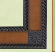
Offered exclusively to Central Oregon by Eastlake Framing. We would like to introduce you to the individually handcrafted, custom "Offset-Inset" frame by Daedalian Frames. This beautiful cherry wood frame effortlessly combines old-world craftsmanship with a Deco/Asian design inspiration. A matching hand detailed fillet has been used to define the inside edge of the Kismet. Mahogany silk mat.
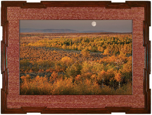
Meet me in the Badlands
Here at Eastlake Framing, we want you to feel good about framing your art. We offer you eco-friendly products that allow the design and creation of beautiful, high quality, custom framing while protecting resources for a healthy environment.
The frame design we have chosen for Greg Burke’s “Meet me in the Badlands” uses a stunning burl frame which is sourced from a manufacturer that practices sustainable harvesting of forests and is FSC (Forest Stewardship Council) and COC (Chain of Custody) certified. The mat board used in this design package has been FSC certified also. This means that the materials used to produce them have come from active reforestation programs and forest friendly harvesting methods.
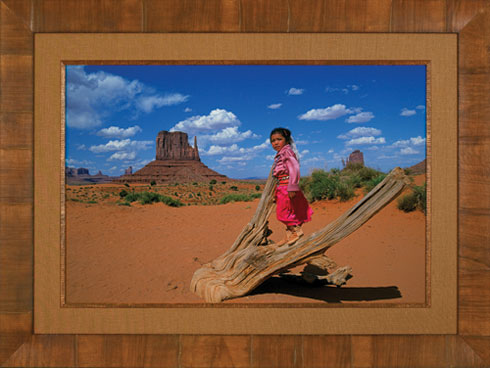
Doli on a Stump
The frame we have chosen for Buddy Mays “Doli on a Stump” is a pure olive veneer, collected from the trunk of the Italian olive tree. A matching fillet is used to create definition on the inside edge of the rustic, open-weave, hand wrapped linen mat. These framing components were chosen to compliment the natural, rustic elements in the photograph. Notice how the beautiful texture of the frame and fillet echo the old, weathered stump Doli is climbing on. The soft, monochromatic color scheme allows your eye to extend the warm, southwest color palette.